
Bad Design: Airplane Armrest Controllers
Reflection on armrest controllers on planes

As someone who loves examining design and its impact on people, I was reminded of one of the worst-designed TV controllers during a recent flight. I put this on a level significantly worse than Norman Doors.
Here it is:
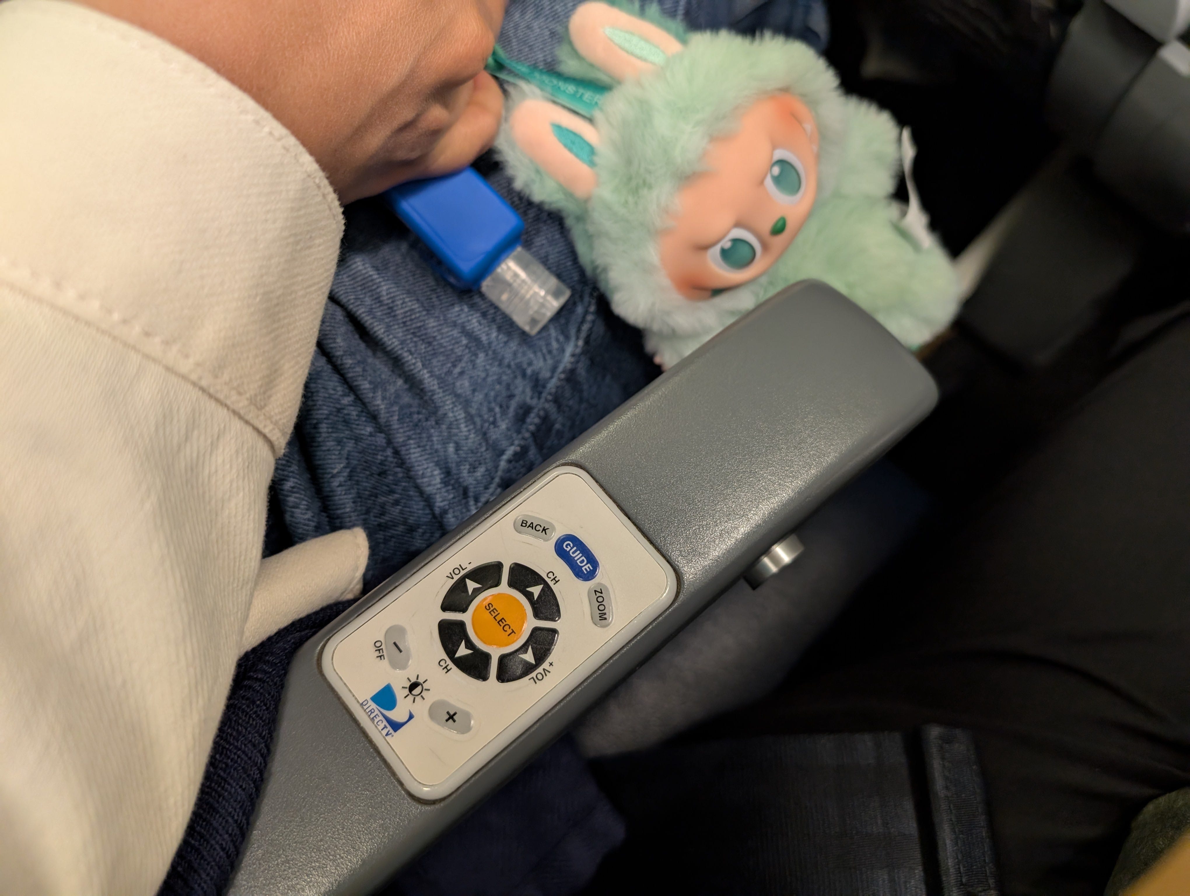
For those who have been fortunate to never have seen this on a flight, this is an armrest with controls to the display nested in it. As you can imagine, many accidental interactions occur because it’s on the armrest. Depending on your thoughts on middle seat armrest etiquette, the middle seat person often “owns” the armrest with control of a neighboring seat’s display.
This controller’s placement can cause so much chaos. Unlike many bad designs that you can avoid and often have a workaround without affecting other people (and often forget about it immediately after), avoiding this one could affect the user’s use of the armrest throughout the flight. Making it worse, the splash zone of this design also extends to neighboring passengers.
The controller includes brightness so sleeping passengers may unintentionally turn up their display (or their neighbors) waking up everyone around them.
I’ve had a stranger change the channel and turn up the volume on my display while they were sleeping (I didn’t have the heart to wake them up to remedy the situation).
Since armrests tend to be used frequently, these controllers are often worn down and sometimes dysfunctional.
Another minor thing is that a middle seat can’t easily determine which remote controls their display.
In most poorly designed products, I often try to empathize with the designers and people who built them. Most of the time, I can rationally brainstorm reasons for the design; these often include saving on development/cost, blindly following system patterns, and adjusting for legacy systems.
In this case, maybe the designers wanted controls on the armrest to avoid any potential disturbance of pressing the controls to the person sitting on the seat where the display is mounted. Or there was no space next to the display; though they were able to fit in a credit card reader on one side (That feature didn’t age well either).
The team had to make major adjustments to get the controls to the armrest. The controller is most likely wired in some fashion. The controller could be directly connected to the display, which would add a non-trivial amount of cabling for each seat. The controller could be wirelessly connected to the display, which could add more complexities for what could go wrong; but the controller would still likely be wired to a power source in this scenario.
I have a difficult time understanding how a team can go out of its way to add complexity and put the controllers on the armrests to produce such an awful experience. Maybe the team that built these armrest controllers put the highest priority on reducing disturbance to the passenger in the seat of the display. Maybe no one on the team was an armrest user. Maybe worse, someone was incentivized to add complexity (e.g. financially). Most likely, the controls were an afterthought, or the display and control teams were completely siloed. No matter the reason, the outcome was a poor customer experience.
I would love the opportunity to speak to anyone who was involved in the design of the armrest controller on planes. It could be an interesting story of how organizations can make poor decisions.
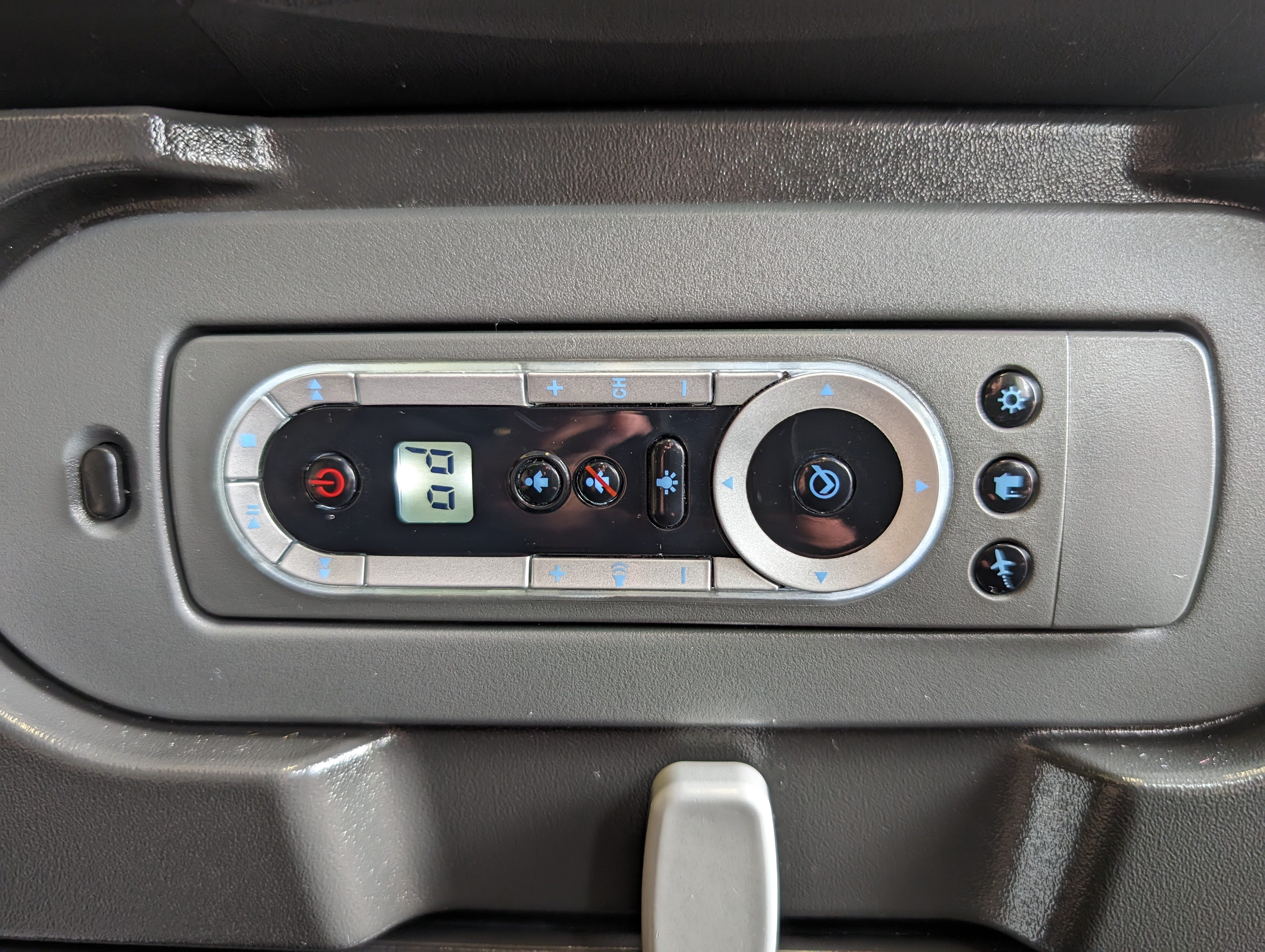
Thankfully, most modern planes have touchscreens or no screens at all. But for those who are interested, there have been other iterations of controllers on planes. Some planes have the controller on the side of the armrest; better than on the top but still a dreadful experience. Other planes have the control next to the display. Some have a detachable controller (as seen below); though, this is probably a nightmare with losing them.
What designs have you been frustrated with lately? (I know I have a running list, but this one has been on my mind for many years.)