
Google's New Look

My phone's home screen is slowly getting a new look due to Google's applications having new icons.
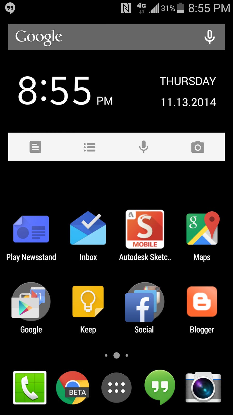
The Google Maps icon really rattled me after today's update. Google Keep's light bulb is now outlined white. It's really odd how application icons have evolved. Remember when they tried to make them 3D like. Now, they seem to be flattening them up with vivid colors.
You probably heard of Material Design; though, you may be confused on what it is. It's just a new look on Android that goes better context on what is going on. It's simple and beautiful. As a user, you mean not be fully cognizant but it'll definitely improvement your experience with the applications.