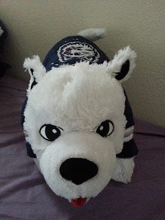
Husky Forever!


UConn released their new Husky logo yesterday. The Husky is more lean and mean. Is this what college athletics really needs though? Is being nice and fluffy not acceptable in the college game? Under the furry and happy Husky that we loved, UConn won a total of 15 NCAA national championships in soccer (2), field hockey(2), and of course basketball (11). The logo was different from other schools, it was delightful and cute. Now the Husky is more like the huskies from Washington, NEU, and NIU. No longer is UConn the only all-white husky that we have come to know; hopefully the Jonathan Husky mascot suit stays the same. And what were they thinking in 1959 and the 1970s...? I wonder why they went away from the 1960s (So cute and awesome).
The new logo does represent UConn athletics more accurately with the face of determination and aggressiveness. But does it represent the student body as well as the former logo? The logo was often used outside of the realm of sports and into the community. I certainly think the previous logo exhibited a sense of community and welcomeness at the University of Connecticut that the new one is lacking.
Though, the husky does seem to be smiling like he's found dinner to hunt for. Like me, he's always going to be constantly smiling. There's a slogan at UConn: "Students Today, Huskies Forever" and I absolutely love it. With the new husky logo, I feel more like a UConn husky. This is because I think I look more similar to Jonathan now; it's a bit creepy how much of myself I see in him. Just think about it...
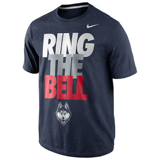
I'll always remember the happy fluffy husky! All my free shirts from UConn are now officially vintage!