UI Car Fail
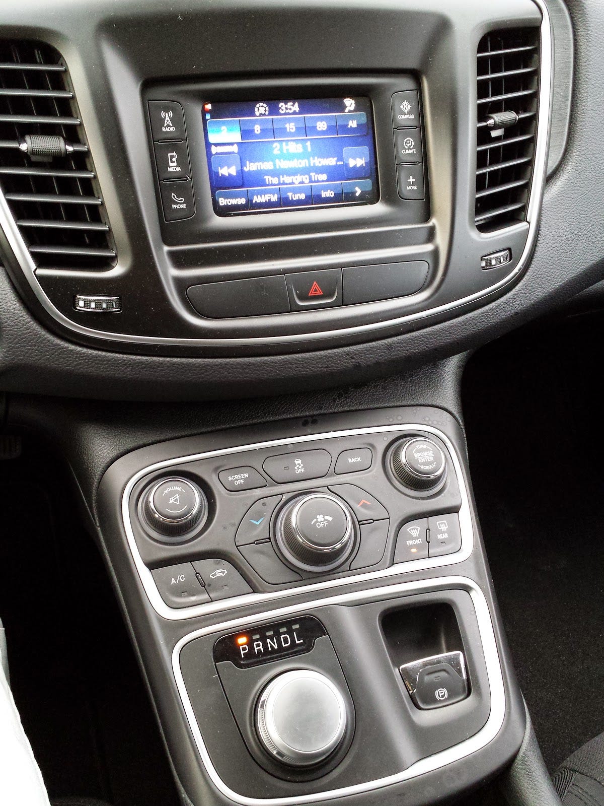
After having a wonderful experience with a Buick Lacrosse, I may have transitioned one of the worst console setups I have ever used. I have a Chrysler 200:

While the dials and buttons are large, the interface is certainly not intuitive. For example, look at the buttons surrounding the middle dial; there are the two buttons to control the temperature (and two non-buttons...). How did you determine what the temperature the air is at? There is an extremely tiny blue/red scale on the top left of the screen; it took me a while to figure it out since I was driving. To change where the air comes out of, you need to press the "Climate" button on the side of the screen then use the touch screen to change it.
The touch screen user interface is pretty terrible as well. Everything seems to be scaled up to sizes that are clumsy to display and make it difficult to navigate.
The "Compass" button literally displays a giant compass that takes up the entire screen. I thought about how that may be used as a GPS navigation button in some models but then realized that those models probably have a larger touch display. Not sure the usefulness of a screen dedicated to a compass...
I feel that this entire interface on the car was purposely made into a painful experience. I want to believe that a team of engineers have to intentionally design something so awful to use. I don't know how something so horrendous made it out to the public market. This isn't the only car to have this setup either, I know the new Jeep Cherokees have it too.
I also do not like the dial instead of the shifter. It feels awkward not having a shifter stick to hold on to while driving.

